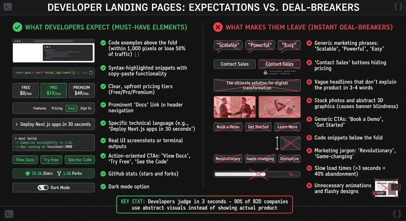
Developers judge landing pages fast. They want proof your product works - code snippets, clear pricing, and easy-to-find documentation. Skip the fluff. If they don’t see value in 3 seconds, they’ll leave.
Here’s what works:
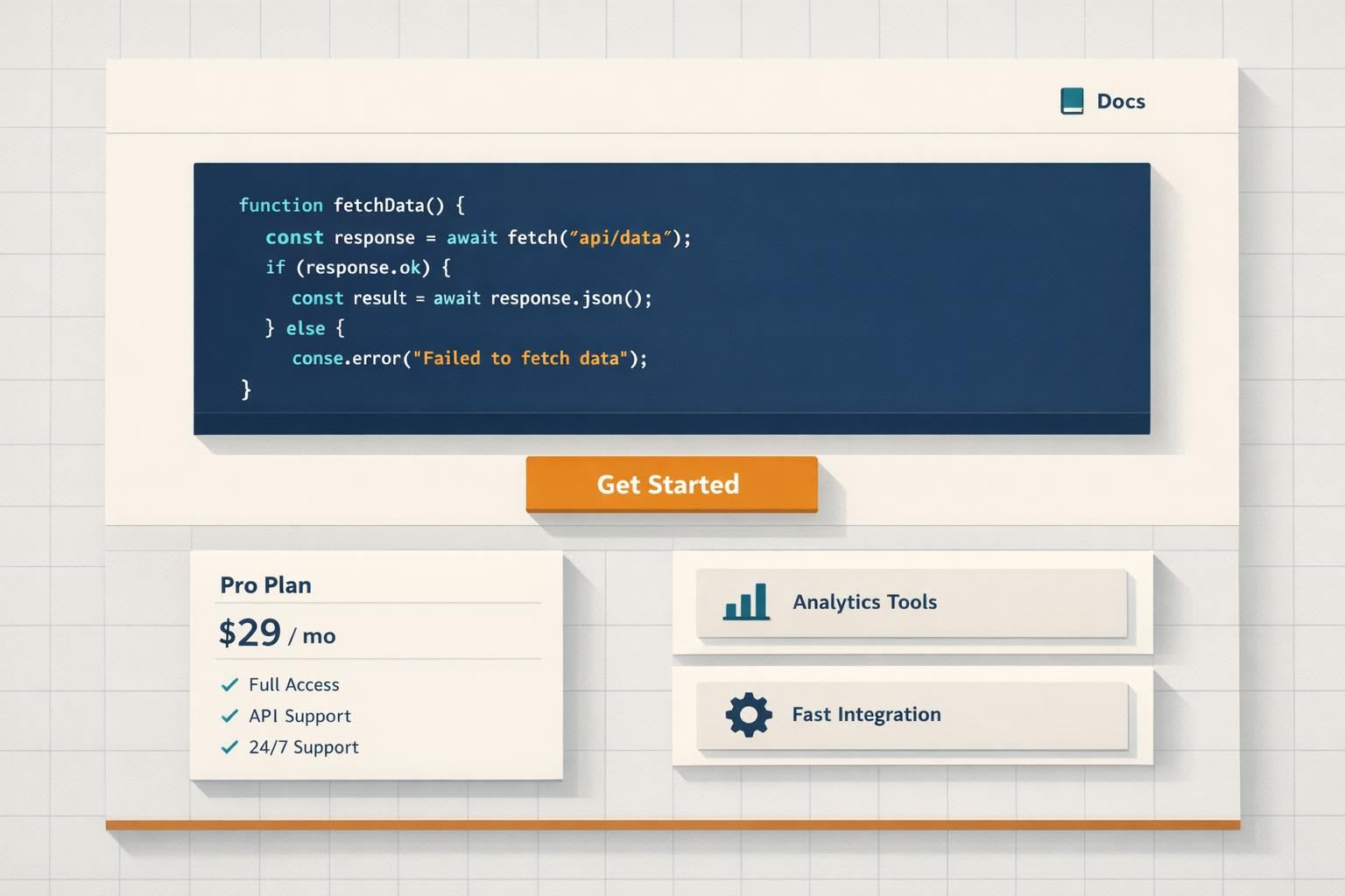
- Code upfront: Show syntax-highlighted snippets above the fold.
- Clear CTAs: Use actions like "View Docs" or "Try Free" instead of "Book a Demo."
- Straightforward pricing: Avoid "Contact Sales" buttons. Be transparent.
- Documentation links: Place them prominently in the header.
- Avoid generic claims: Phrases like "Scalable" or "Powerful" don’t resonate.
Developers trust specifics, not hype. A landing page with real examples, precise language, and actionable steps will engage them and boost conversions.
What Developers Expect (and What Makes Them Leave)
When it comes to technical validation, developers are quick to judge. They scan for specific cues that confirm your product's technical value. If those signals are missing or hard to find, they won’t hesitate to move on.
For developers, code comes first, followed by pricing and documentation. Any friction in accessing these core elements can be a dealbreaker.
Must-Have Elements: Code Examples, Pricing, and Documentation Links
The "Time to Code" rule is a crucial benchmark: if developers have to scroll more than 1,000 pixels to find a syntax-highlighted code block, you risk losing up to 50% of your technical traffic . Code examples are a key trust signal. Developers use what Ninad Pathak calls an "instant simulation" to assess code - they quickly evaluate its complexity, relevance, and whether it aligns with modern standards .
Pricing transparency is just as important. Hiding costs behind a "Contact Sales" button is a surefire way to lose trust. Developers expect clear, upfront pricing tiers, such as free, professional, and premium plans. If your product supports multiple languages (like Python, Go, or Node), include toggle tabs in your code snippets to showcase compatibility right away .
Documentation also plays a critical role. Links to documentation should be easy to find - ideally in the header navigation. A prominently placed "Docs" link signals a commitment to technical depth and ongoing support, which developers highly value.
Instant Deal-Breakers: Marketing Language and Vague Claims
While these elements help build trust, certain missteps can drive developers away just as quickly. Overly generic marketing phrases like "Scalable", "Powerful", or "Easy" fall flat with developers . As Filip Nakov, founder of Nakora, explains:
If your first 3-4 headline words don't instantly explain what your product does, they [developers] won't stick around .
Headlines such as "Unlock the power of AI" or "Supercharge your workflow" often sound like they’re aimed at managers, not engineers. In contrast, a headline like "Deploy Next.js apps in 30 seconds" is clear, specific, and actionable .
Visual elements matter too. Stock photos and abstract 3D graphics can cause "banner blindness" - developers tend to skip over them in favor of content with higher information density. Instead, showing real UI screenshots or terminal outputs can make your page stand out.
Even your call-to-actions (CTAs) need to align with developer expectations. Generic CTAs like "Book a Demo" or "Get Started" don’t resonate. Developers want to explore and test your product, not schedule a meeting. Misaligned CTAs can directly hurt your conversion rates .
Next, we’ll dive into how layout and functionality can shape a developer-focused landing page.
Core Components of a Developer Landing Page That Converts
A developer landing page thrives on four key elements: a hero section that clearly communicates your product's purpose, a working code sample that demonstrates its capabilities, social proof from other developers, and a clear call-to-action. Each plays a unique role in helping developers evaluate your product effectively.
Hero Section: Technical Value in One Sentence
Your headline needs to answer three questions in just a few seconds: What is it? Who is it for? What does it do? . For instance, "Deploy Next.js apps in 30 seconds" works because it specifies the technology (Next.js), the action (deploy), and the timeframe (30 seconds). Compare that to a vague headline like "Unlock the power of modern deployment", which leaves developers guessing.
To craft a compelling headline, follow this formula: [Adjective] + [Keyword] + [ICP/Use Case] . For example, "Limitless web data infrastructure for AI & BI" instantly communicates the scale, domain, and use cases.
The hero section should also feature a code snippet above the fold. This provides immediate technical context and lets developers, as Ninad Pathak puts it, perform an "instant simulation" of your product's complexity and relevance . A live example can further reinforce this.
Interactive Demo or Working Code Sample
After establishing your product's value, let developers see it in action. For developers, code is the ultimate proof. A working example validates your claims far better than any description. Instead of saying, "Add authentication in minutes", show them the actual code:auth.signInWithOAuth({ provider: 'github' }) .
The type of code sample you use depends on your product. APIs might benefit from "Hello World" snippets, infrastructure tools might use YAML or JSON configs, and frontend libraries could shine with interactive editors . Focus on the "magic line" - the part of the code that demonstrates your product's unique value. Skip unnecessary boilerplate like imports or setup code .
For more complex tools, include an interactive demo that requires no sign-up. Visuals paired with relevant content increase engagement by 80% , and for developers, working code is the most effective visual. Once developers see the code in action, back it up with real-world validation.
Engineer Testimonials and Technical Case Studies
Developers trust data and technical details, so use metrics and implementation examples to build credibility. Effective social proof could include GitHub stars and forks, architecture diagrams, or detailed case studies .
While GitHub stars show broad interest, forks are a stronger indicator of real-world experimentation . If your product is open source, display live GitHub stats, including contributor activity and maintenance frequency. For paid tools, share case studies that highlight specific stack details - like "NextAuth v5 with Google OAuth and Prisma adapter" - rather than generic descriptions .
Anton Lovchikov, Head of Design at Evil Martians, emphasizes the importance of appealing to different developer segments by showcasing both paid customer conversions and immediate value through open-source contributions or documentation . Include quotes from engineers that focus on technical outcomes to further build trust.
One Clear Call-to-Action
Every element on the page should guide developers toward a specific action. A single, precise CTA tailored to their evaluation stage works best. Generic phrases like "Get Started" or "Book a Demo" often fall flat because they don’t clarify what happens next. Instead, opt for technical actions like "Install", "Deploy", "Fork on GitHub", or "View Docs" .
Pair a primary CTA (e.g., "Start Building") with a secondary one (e.g., "View Docs") to meet developers where they are in their decision-making process . Anton Lovchikov advises this dual approach to cater to both paid customers and those seeking immediate, hands-on evaluation:
Leveraging two CTAs in the hero allows you to both convert paid customers and provide immediate value to developers, either through open source or direct access to documentation .
Reduce hesitation by adding microcopy beneath the CTA, such as "No credit card required", "14-day free trial", or "Open source" . For paid tools, including the price in the button - like "Buy Now - $99" - can set clear expectations and attract serious buyers . Personalized CTAs have been shown to boost conversion rates by up to 202% .
Writing Copy That Developers Trust
Developers are quick to recognize marketing jargon - and when they do, they’re likely to leave. Your landing page copy should feel like it was written by an engineer who truly understands the problem, not a marketer trying to push a solution. This means swapping vague claims for technical specifics and letting the product speak for itself.
Use Precise Technical Language
Every sentence on your page should clearly answer, "What does this actually do?" Avoid generic adjectives and focus on specifics. For instance, instead of saying your tool is "comprehensive", you could specify: "NextAuth v5 with Google + GitHub OAuth and Prisma adapter."
Similarly, trade phrases like "fast deployment" for something concrete: "Deploy Next.js apps in 30 seconds using edge functions." This level of clarity can lead to a 259% increase in engagement .
It’s also important to be upfront about limitations. Acknowledging constraints - like rate limits or regional restrictions - builds trust. For example, if your API has a free tier capped at 1,000 requests per hour, say so. Transparency about potential friction shows you understand real-world use cases.
Finally, back up your claims with real code examples to make your points tangible.
Demonstrate with Examples, Not Descriptions
Developers often skim for details and skip over marketing fluff. Instead of lengthy descriptions, let your code do the talking. As Ninad Pathak wisely puts it:
Code is objective. Code is truth. - Ninad Pathak, Pathak Ventures
If a visitor has to scroll more than 1,000 pixels to find a code block, you risk losing up to 50% of your technical audience . So, make sure examples are easy to find and well-placed.
When presenting code, use semantic variable names that reflect real-world scenarios. Avoid placeholders like foo or bar; instead, use something meaningful like createUser('elon@tesla.com', { plan: 'enterprise' }). This not only makes your examples relatable but also demonstrates that your product is ready for real production environments.
Skip the Hype and Exaggeration
Once your copy is grounded in technical precision and real examples, steer clear of over-the-top claims. Words like "revolutionary", "best-in-class", or "game-changing" don’t resonate with developers - they often do the opposite. These kinds of unverified superlatives can harm your credibility.
Keep your focus on measurable outcomes. For instance, instead of saying "incredibly fast", specify: "response times under 100ms." Instead of "seamless integration", show the exact API call. This approach not only builds trust but also makes your claims more compelling. Remember, with five times as many people reading the headline as the body copy , your headline space is too valuable to waste on empty hype.
Design Elements That Developers Prefer
The way your landing page looks can play a big role in earning developers' trust. A design that mirrors the tools they use daily - like IDEs, terminals, or documentation sites - feels familiar and reduces mental effort. This familiarity shows you understand their workflow and aligns with the precise messaging and clear CTAs mentioned earlier. The idea is to step back and let your product take center stage.
Dark Mode and Syntax-Highlighted Code Blocks
Developers spend hours working in dark-themed editors and terminals. Offering a dark mode option on your page immediately connects with this preference. But what really earns their trust is how you display code.
Using libraries like shiki or prism.js to create real, syntax-highlighted code blocks makes a big difference. These blocks should allow developers to copy-paste snippets directly, enabling them to dive into experimentation right away. This taps into the "Time to Code" principle: if a syntax-highlighted code block isn’t visible above the fold, you risk losing a chunk of your technical audience.
A great example is Tailwind CSS, which places a code snippet front and center in its hero section. This lets developers immediately gauge the framework’s complexity and approach. Offering language toggle tabs - such as Python, Node.js, or Go - further demonstrates respect for the developer’s ecosystem, avoiding a one-size-fits-all approach .
While showcasing code effectively builds trust, a clean and uncluttered layout ensures these elements stand out.
Simple Layouts Without Unnecessary Animation
Developers gravitate toward clean, straightforward designs. Centered layouts with max-width containers outperform overly animated or flashy marketing sites. Developers often ignore areas that feel like "fluff" or ads, focusing instead on sections with high information density . Flashy animations can feel like distractions, slowing down the page and obscuring the actual product.
For instance, Linear’s landing page, praised by Evil Martians in 2025, uses a static product shot in its hero section. This approach gives users a clear view of the tool’s interface without unnecessary distractions . Prioritize strong typography, ample spacing, and functional visuals - like real product screenshots or architecture diagrams - over abstract 3D illustrations. Interestingly, 90% of business-to-developer companies rely on abstract visuals or stock photos instead of showing the actual product, which developers often interpret as a lack of confidence in the tool .
When developers have to scroll past "Trusted By" logos or marketing-heavy copy before seeing real code or product visuals, they quickly lose interest. Keep your layout simple, ensure load times are under 2 seconds, and focus on showcasing the tool in action.
CTAs That Match Developer Intent
The call-to-action (CTA) button on a developer landing page should feel like a natural progression, not a sales pitch. Developers prefer to explore, test, and validate a product on their own terms before sharing personal information or interacting with a sales team. The wording of your CTA plays a key role in showing whether you truly understand their mindset.
Specific Action CTAs: "View Docs", "Try the Playground", "See the Code"
Developers are drawn to CTAs that offer immediate technical engagement. Phrases like "View Docs", "Try the Playground", "See the Code," or "Explore the Repo" resonate because they align with what developers typically want to do - evaluate the technical aspects, experiment with the product, or dive into the implementation details. A good rule of thumb? Your CTA should complete the sentence, "I want to ___." Examples include "deploy my first app" or "explore the docs", which guide users with clarity and purpose.
"Nobody wants to 'Book a Demo.' Developers want to try your product now!" - Filip Nakov, Founder, Nakora
Adding a short line of micro-copy below the CTA can also address potential hesitation. For example, phrases like "No credit card required", "2-minute setup," or "Works with GitHub" reduce uncertainty and explain what happens after clicking. If your product is priced under $100, try including the cost directly in the button, such as "Buy Now - $99", to set clear expectations and encourage action.
These specific CTAs demonstrate why generic ones often fail to connect with this audience.
Why "Get Started" and "Book a Demo" Underperform
Generic CTAs like "Get Started" or "Learn More" fall flat with technical audiences because they lack clarity about the next step. Developers tend to dismiss these as vague marketing language. Similarly, "Book a Demo" feels like a sales hurdle rather than a technical opportunity, which can deter users who prefer hands-on exploration during their initial evaluation.
Even small changes in wording can make a big difference. For instance, switching from "Sign up for free" to "Trial for free" resulted in a 104% increase in trial starts . These subtle shifts show how important it is to align your CTA with developer expectations.
When a developer clicks through from a daily.dev ad, they’re already in evaluation mode. Your CTA should honor that intent by offering clear, actionable choices like "Explore the docs" or "Try the playground." For those further along, a secondary option such as "Install" can provide a path to adoption without disrupting their exploratory process. This dual-CTA approach respects their stage in the journey while keeping them engaged.
Testing and Optimizing Developer Landing Pages
Developer landing pages often face a unique hurdle: low traffic volumes. Unlike consumer-facing products that might attract thousands of visitors daily, developer tools sometimes see fewer than 1,000 unique visitors a week . This makes traditional A/B testing tricky. Instead of focusing on small tweaks, you have to prioritize bold, transformative changes that can yield noticeable results even with limited data.
The focus should be on high-impact variables - elements that can create significant performance shifts. Small adjustments, like changing button colors, require massive traffic to show meaningful differences. On the other hand, testing substantial changes - like reworking headlines, restructuring the page, or adding different proof elements - can generate larger, measurable outcomes faster .
High-Impact Test Variables: Headlines, CTAs, and Load Speed
Some elements directly influence whether a developer stays on your page or bounces. Start with these:
Hero headlines: These are your first and most important test area. Compare specific technical promises (e.g., "Scan any MCP server in 60 seconds") with broader marketing messages (e.g., "Supercharge your workflow"). Each approach can deliver drastically different engagement rates .
CTA wording: Developers respond differently to action phrases like "View Docs" versus "Get Started." Test specific, actionable CTAs against more generic ones to see which generates more qualified interactions. Track micro-conversions - such as "Copy Code Snippet", "View Documentation", or "CLI Install Command" - since these actions happen more frequently than larger conversions like paid subscriptions .
Page load speed: Before diving into copy or design, address how quickly your page loads. Every second of delay reduces conversions by 7%, and around 40% of visitors abandon sites that take longer than three seconds to load . Developers are especially impatient with slow-loading pages. Use server-side testing to avoid the 200–800ms "flicker" caused by JavaScript swapping elements, which frustrates technical users and distorts your data .
Another variable worth testing is the placement of a code snippet above the fold. For technical audiences, clear implementation details often outperform polished visuals like GitHub stars or company logos . Developers arriving from platforms like daily.dev are already in "evaluation mode", so your page should cater to their intent by prioritizing technical clarity and immediate value over marketing fluff.
Running Valid Tests with Limited Traffic
When traffic is limited, strategic planning becomes essential to achieve statistically meaningful results. While the industry standard is 95% confidence (allowing only a 5% chance of random error) , you can lower this to 80% or 85% to make decisions faster in low-traffic situations, accepting a slightly higher margin of error .
Before starting any test, use a sample size calculator to determine the required duration. If achieving significance would take months or even years, switch to qualitative methods like usability testing, heatmaps, or developer surveys . These tools help uncover why users are leaving, even without large data sets.
For faster results, consider site-wide testing. Instead of focusing on a single landing page, test changes across all pages in a category - such as API reference pages or CLI tool pages - using URL patterns. This approach pools traffic, helping you gather data more quickly .
In extremely low-traffic scenarios, sequential testing can be a viable option. Run each variant one after the other, capturing all traffic for each version. While this method is less precise due to external factors like seasonality or market shifts, it's still better than not testing at all .
"You can still optimize even if you can't A/B test." - Peep Laja, Conversion Expert
One particularly useful metric for developer-focused pages is "Time to First Hello World". This measures how quickly a developer can go from landing on your page to successfully running their first example. It’s a great proxy for long-term activation and directly connects to reducing friction in your try-out experience . By focusing on this metric, you ensure your page delivers on the technical expectations developers bring with them.
Landing Page Structures by Product Type
When designing a landing page for your developer product, it's crucial to tailor the layout to match the unique needs of your offering. Different products - like APIs, CLI tools, open-source projects, and SaaS platforms - require distinct approaches to showcase their value. For example, an API page should highlight connectivity, while a CLI tool page must emphasize quick installation and execution. Here’s how to structure your landing pages effectively for each product type.
API Product Pages
For APIs, the code itself is the product, so your landing page should reflect that. Displaying a syntax-highlighted code block in the hero section is a must - abstract illustrations won't cut it. Developers want to see actionable, clear examples right away.
A strong API snippet includes:
- Installation commands
- Authentication details
- Sample request and response
Adding toggle tabs for popular programming languages like Python, Node.js, or Go demonstrates consideration for diverse developer ecosystems. Avoid placeholders like foo or bar; instead, use meaningful examples like createUser('elon@tesla.com') to make the use case relatable .
"For a developer tool, the product is the code." - Ninad Pathak, Founder, Pathak Ventures
Your page should also act as a gateway to comprehensive documentation. Include direct links to API references and explain key processes like automation or background syncing . For open-source APIs, prominently display GitHub metrics like forks to build trust with technical audiences .
CLI Tool Pages
CLI tools thrive on simplicity and speed. Start with an installation command in the hero section, paired with a "copy to clipboard" button for convenience . Developers evaluating CLI tools prioritize quick results over lengthy explanations.
Boost engagement by:
- Showing the most common command and its output
- Including flag documentation for easy copying
- Offering interactive elements, like a GIF of the CLI in action or a terminal emulator for live testing
Highlight features that appeal to automation-focused users, such as non-interactive modes, force flags (-f, --force), and machine-readable outputs. Error messages should be clear and actionable, offering suggestions like "Did you mean...?" to show your tool is developer-friendly .
Open-Source Project Pages
For open-source projects, trust signals are everything. Showcase your GitHub link, contribution guide, license, and community channels prominently . Metrics like stars, forks, and contributor activity help establish credibility .
"For technical audiences, proof beats polish." - Avery Carter, Senior SEO Content Strategist
Encourage exploration with CTAs like "View on GitHub", "Read the Docs", or "See the Code" . Use code snippets to highlight extensibility and demonstrate how developers can modify or extend the project. Messaging like "Free forever for solo devs" or "Open Source" can lower the barrier to entry .
SaaS Platform Pages
SaaS platform pages should focus on integration options and business outcomes. Instead of a generic feature list, use case studies and integration details to establish credibility. Pricing tiers with clear feature breakdowns and price anchoring are essential .
Include technical case studies with measurable results, such as specific metrics that highlight performance improvements . Customer logos and integration options help establish compatibility with existing workflows. A "Hello World" snippet can demonstrate how quickly developers can achieve value . Conversion-focused CTAs like "Start Free Trial" or "Get Started" work well, especially when paired with reassuring microcopy like "No credit card required" .
| Page Type | Primary Visual | Key Trust Signal | Main CTA |
|---|---|---|---|
| API Product | Syntax-highlighted code snippet | GitHub forks and response formats | "View Docs" or "Get API Key" |
| CLI Tool | Terminal recording or install command | Time-to-value demonstration | "Install Now" or "Try Free" |
| Open-Source | Code snippet showing extensibility | Stars, forks, contributor map | "View on GitHub" or "Read Docs" |
| SaaS Platform | Product UI screenshots or demo | Customer logos and case studies | "Start Free Trial" |
Connecting daily.dev Ads to Your Landing Pages
This section dives into how to align the messaging of your daily.dev ads with your landing page to create a seamless experience for developers. When a developer clicks on your ad, they’re looking for immediate validation of the claims made - typically within the first 3 seconds . For instance, if your ad says, "Deploy in 60 seconds", your landing page needs to showcase that exact promise prominently in the headline. This kind of alignment builds trust and reinforces the straightforward, technical communication developers value.
Match Ad Copy to Landing Page Headlines
Your landing page headline should echo the main promise of your ad, especially the first 3–4 words. Developers tend to skim for concise, high-value information and will quickly dismiss anything that feels like marketing fluff .
For example, if your ad focuses on a specific framework like "Next.js 14", ensure that exact version is mentioned in your landing page copy. Similarly, if the ad highlights a feature like "Scan MCP servers", make sure that capability is emphasized above the fold. Even a small adjustment to your headline can significantly boost engagement - by as much as 259% .
Consistency in terminology is crucial. If your ad uses the word "framework", don’t switch to "library" on the landing page. Keeping the language consistent reassures developers that they’re in the right place and builds credibility .
Maintain Visual and Tone Consistency
Visual consistency is just as important as matching your messaging. If your daily.dev ad uses dark mode and syntax-highlighted code blocks, your landing page should reflect the same design style . Developers notice when there’s a disconnect between the visuals of an ad and the landing page, and it can erode trust.
Avoid generic phrases like "powerful" or "streamline" on both your ads and landing pages . Instead, include a working code snippet above the fold. Studies show developers are more likely to engage with clear technical proof and will often skip over sections that resemble generic advertisements .
If your ad features a specific call-to-action (CTA) like "View Docs" or "See the Code", make sure that action is front and center on your landing page. For example, Apollo GraphQL saw a 20% increase in signups by placing a CTA directly in their documentation header, aligning with where most developers clicked through . Streamlining the path from ad to action reduces friction and improves conversion rates.
| Ad Element | Landing Page Alignment |
|---|---|
| Headline Hook | Repeat or expand upon the H1 headline |
| Technical Jargon | Use consistent terminology (e.g., "framework" vs. "library") |
| Visual Style | Match design elements like dark mode and syntax highlighting |
| Primary Promise | Highlight the same outcome (e.g., "Free for solo devs") |
| CTA Intent | Ensure CTAs like "View Docs" lead to the expected page |
Conclusion
Developer landing pages thrive on technical precision and immediate proof. Developers often make snap judgments - within just 3 seconds - to determine if a tool addresses their specific needs. That means every element on your page must work hard to demonstrate value right away.
Here’s the essence of what works: Place code examples front and center, use concise and accurate language, and let the technical details do the talking. Transparency is equally essential - make pricing clear and ensure documentation is easily accessible. As Ninad Pathak from Pathak Ventures aptly says:
Code is objective. Code is truth .
When developers see working code, they can immediately assess its relevance and potential.
For this audience, authenticity in the form of real metrics and actionable outcomes beats flashy designs every time. A page featuring syntax-highlighted code, real GitHub stats, and specific claims like "Deploy in 60 seconds" will always resonate more than vague, generic promises . These elements don’t just inform - they build trust. Filip Nakov, Founder of Nakora, captures this perfectly:
Every section needs to earn trust, not demand attention .
This approach becomes even more critical when linking your daily.dev Ads to these landing pages. Developers clicking on your ad expect the same clarity and technical depth on your page. By aligning your ads with a landing page that’s specific, detailed, and honest, you create a consistent experience that drives conversions.
The takeaway is clear: developers invest in precise solutions, not broad promises . Build your landing pages with this in mind, and you’ll see the difference.
FAQs
What code should go above the fold?
The above-the-fold section of a developer landing page needs three key elements: a clear headline, a concise subheadline, and a primary call-to-action (CTA).
- The headline should immediately communicate the product's benefit - what makes it worth a developer's attention.
- The subheadline should briefly explain who the product is designed for and how it works, keeping it simple yet informative.
- The CTA should feature action-driven text that resonates with developers, using phrases like "View docs," "Try free," or "See the code."
These elements work together to grab attention and provide just enough information to encourage further exploration.
How do I test a developer landing page with low traffic?
For developer landing pages with low traffic, it's essential to shift your focus toward qualitative feedback and other creative testing methods. Tools like surveys, interviews, or usability testing can help you uncover valuable insights and pinpoint areas that need improvement. Instead of depending entirely on signups or purchases, track micro-conversions, such as clicks or scroll depth, to gauge user engagement. Additionally, experimenting with bold design changes or tweaking high-impact elements can yield useful data, even when your sample size is small.
What’s the best CTA for my dev tool?
When crafting a call-to-action (CTA) for your developer tool, aim for something specific, actionable, and aligned with what developers actually need next. Generic phrases like "Get started" often fall flat. Instead, consider CTAs that directly address developers' goals, such as:
- "View docs": Perfect for those looking to dive into technical details.
- "Try free": Encourages users to begin a trial and experience the tool firsthand.
- "See the code": Appeals to developers who want to examine example code or integrations.
These types of CTAs not only speak to developers' priorities but also provide the clarity and depth they value, making it more likely they'll engage and convert.