
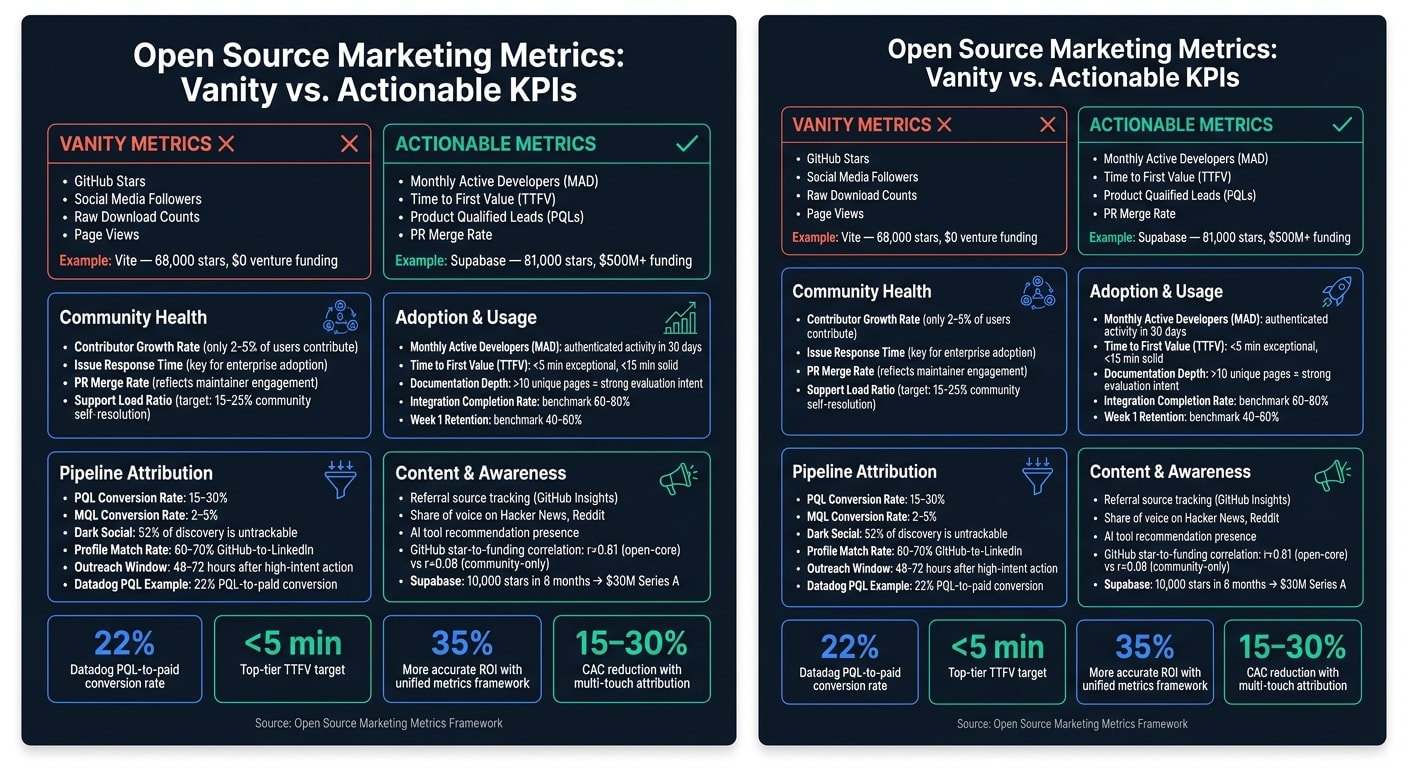
Open source marketing often struggles with connecting community metrics to revenue. Many teams focus on GitHub stars, downloads, or social media followers, which look impressive but don’t reveal the real business impact. Instead, effective metrics should track how developers discover, adopt, and engage with a project - and how these activities drive pipeline growth.
Key Points:
- Vanity metrics like GitHub stars don’t correlate strongly with funding or revenue. For example, Vite has 68,000 stars but no venture funding, while Supabase has 81,000 stars and over $500M in funding.
- Focus on actionable metrics in four categories:
- Community Health: Contributor growth, issue response time, PR merge rates.
- Adoption & Usage: Monthly Active Developers (MAD), Time to First Value (TTFV), documentation engagement.
- Pipeline Attribution: Product Qualified Leads (PQLs), enterprise signals, multi-touch attribution.
- Content & Awareness: Developer mentions, documentation performance, referral data.
Insights:
- Metrics like PQLs (users achieving technical milestones) often convert at 15–30%, much higher than traditional marketing leads.
- Time to First Value (TTFV) under 15 minutes boosts adoption. Top tools aim for under 5 minutes.
- Multi-touch attribution models (U-shaped, W-shaped) better reflect long OSS sales cycles compared to single-touch models.
By shifting focus to meaningful metrics, you can tie open source growth to revenue and make data-driven decisions.
Community Health Metrics
A thriving open source community relies on more than just flashy numbers like star counts. True health comes from active contributor participation and maintainer well-being. By focusing on the right metrics, you can tell the difference between a project that's growing steadily and one that's losing steam, even if its star count is climbing.
Core Metrics for Community Health
To understand whether a community is genuinely thriving, focus on three key metrics: contributor growth rate, issue response time, and PR merge rate.
Contributor growth rate tracks how many new contributors join over time and whether any of them evolve into maintainers. Typically, only 2–5% of users contribute to open source projects, so even small increases in contributors signal a healthy, trusted project . This metric highlights whether developers see enough value in the project to commit their time and effort.
Issue response time measures how quickly the first helpful response is provided. This is vital for reducing the risk of developers abandoning the project, particularly when they're evaluating it for production use. GitHub’s "Developer Happiness Index" underscores the importance of speedy issue resolution, alongside good documentation and contribution rates, as a predictor of repository adoption and enterprise sales .
PR merge rate reflects how efficiently contributions are processed. A high merge rate shows that contribution guidelines are clear and maintainers are engaged. On the other hand, a low merge rate - especially when paired with long review times - can deter future contributors.
These core metrics together offer a snapshot of the community's potential for long-term success. However, numbers alone don’t tell the whole story - understanding engagement and sentiment is equally important.
Engagement and Sentiment Metrics
Quantitative metrics are essential, but combining them with sentiment analysis gives a fuller picture of community health. Tools like Common Room and Orbit can help detect shifts in engagement patterns . One way to gauge this is by tracking the community contribution ratio - the balance between users who ask questions and those who answer them. An improving ratio indicates a more self-sufficient community, which eases the support burden on your team.
For example, MongoDB found that developers who answered at least one community question within their first 90 days had 65% higher retention rates and 40% greater usage expansion compared to those who didn’t . This highlights the value of tracking how deeply members engage, not just how many join.
Another indicator is the complexity of questions raised in issue trackers. Detailed, technical questions often suggest serious adoption intent, while basic troubleshooting queries might indicate earlier stages of user engagement.
"Open source activity provides unique measurement opportunities... because technical contributions offer transparent, measurable indicators of product adoption and community health." - Jono Bacon, Founder, Stateshift
Sustainability Indicators
Metrics that track immediate activity are important, but sustainability indicators reveal whether the community can thrive in the long run. A major red flag is a skewed contributor-to-maintainer ratio, where a small group of maintainers handles most reviews, responses, and merges. This imbalance can lead to burnout.
Another key metric is the support load ratio, which measures how many issues are resolved by community members versus your internal team. In a robust ecosystem, about 15–25% of users actively participate in forums or support channels . Over time, a growing share of these interactions should shift to peer-to-peer support. If your team is still resolving the majority of issues after a year or more, it’s a sign the community hasn’t reached self-sustaining momentum and may need intervention.
Adoption and Usage Metrics
Measuring Adoption
GitHub stars might look impressive, but they don’t tell the full story about active usage. What really matters are download counts, active installs, and package registry rankings on platforms like npm, PyPI, and Docker Hub. These metrics show how well your project integrates into developer workflows.
If you’re managing a multi-language project, Libraries.io is a handy tool to track usage stats across multiple registries . A steady rise in registry rankings, paired with growing weekly downloads, is a much better indicator of growth than a temporary spike in stars.
One of the most telling metrics is Monthly Active Developers (MAD) - developers who make at least one authenticated API call, commit, or configuration change within 30 days . This metric filters out passive installs and one-time testers, giving you a true measure of active engagement.
Another key metric is Time to First Value (TTFV), which measures how quickly a new user achieves a meaningful outcome - like a successful API call, deployment, or dashboard setup. Top-tier developer tools aim for a TTFV under 5 minutes, while 5–15 minutes is still a solid range . For example, Vercel streamlined its onboarding process so developers could deploy to production in under 60 seconds .
With adoption metrics in place, the next step is to dive deeper into how developers interact with your tool and its documentation.
Usage Behavior and Documentation Engagement
Adoption metrics show interest, but usage behavior and documentation engagement reveal how invested developers are in your tool. Downloads and installs are just the starting point - documentation interaction is where deeper exploration happens.
Documentation page views act as a proxy for intent. Developers who view 5 or more unique documentation pages are 340% more likely to convert compared to those who view just one page. Stripe’s documentation engagement data highlights this pattern . Tracking users who explore 10 or more pages signals even stronger evaluation intent .
"Documentation IS marketing." - Iris, Open Source Marketing Strategist
Analyzing documentation search analytics can uncover gaps in user guidance. For example, tracking zero-result searches or bounce sequences can point to areas where users are struggling . Tools like GitBook and Google Analytics 4 can help surface these insights. Homebrew, for instance, uses this data to prioritize fixes and features based on real developer behavior .
Another important metric is the feature adoption rate - the percentage of users who move from installation to using a core feature. Combine this with the integration completion rate (the percentage of users who fully implement an SDK or API), which typically ranges between 60–80% for well-designed tools . If your integration completion rate falls below this range, it’s often a sign that the issue lies in your documentation or onboarding process rather than the product itself.
These metrics don’t just track evaluation intent - they also indicate when developers are ready for deeper integration, aligning well with broader pipeline goals.
| Metric | What It Measures | Benchmark |
|---|---|---|
| Monthly Active Developers (MAD) | Genuine ongoing usage | Project-specific; track trend over time |
| Time to First Value (TTFV) | Onboarding efficiency | <15 minutes (exceptional: <5 minutes) |
| Documentation depth | Evaluation intent | >10 unique page views per session |
| Integration completion rate | Depth of adoption | 60–80% for successful developer tools |
| Week 1 retention | Early engagement | 40–60% |
Keep in mind that client-side tracking can miss key developer activity due to ad blockers and privacy tools. To get a more accurate picture, rely on server-side tracking through authenticated API calls and telemetry data .
Pipeline Attribution for Open Source
Connecting OSS Activity to Pipeline
Usage metrics might show engagement, but pipeline attribution uncovers buying intent. Many teams mistakenly focus on counting activities rather than identifying signals that reflect meaningful technical progress.
The key shift here is moving from Marketing Qualified Leads (MQLs) to Product Qualified Leads (PQLs). PQLs are users who achieve specific technical milestones, like completing an API integration. Why is this important? Because PQL-to-customer conversion rates for developer tools typically range from 15–30%, while MQLs often convert at a much lower rate of 2–5% . Take Datadog as an example: they define PQLs as users who send at least 100 monitoring events and stay active for seven or more days. This approach delivers a 22% PQL-to-paid conversion rate .
"Developer-focused companies that implement specialized measurement frameworks see 35% more accurate ROI calculations." - Jono Bacon, Founder, StateShift
One of the biggest challenges in attribution is dark social. About 52% of developer tool discovery happens in untrackable spaces like Slack channels, Discord servers, and private forums . To address this, you can use proxy metrics like in-depth documentation engagement or post-purchase referral surveys alongside your usual funnel data. These signals help pinpoint prospects who are ready for enterprise-level discussions.
Enterprise-Ready Signals
Not all community interactions are equal. Below is a breakdown of GitHub signals and what they reveal about user intent:
| Signal Type | Intent Level | What It Means |
|---|---|---|
| Star | Awareness | Saved for future reference |
| Fork | Evaluation | Testing or reviewing the code locally |
| Issue | Engagement | Actively using the tool and troubleshooting |
| Pull Request | Active Usage | Contributing back to the project |
| Commit | Adoption | Fully integrated into production workflows |
This hierarchy helps translate community engagement into measurable business outcomes.
Beyond GitHub, team collaboration behaviors are key indicators of enterprise potential. For instance, when a user invites teammates to a shared workspace or sets up role-based access, it often signals enterprise-level evaluation. Another useful tactic is profile enrichment - matching GitHub usernames to LinkedIn profiles or work emails. This approach typically achieves a 60–70% match rate, with 40–55% of those yielding verified work emails . Focus on contributors from companies with 50–5,000 employees and senior technical titles like Staff Engineer or VP of Engineering, as these profiles often align with high-fit Ideal Customer Profiles (ICPs).
Timing is critical. Reach out within 48–72 hours of high-intent actions, such as a fork or pull request, to increase reply rates . Personalize your outreach by referencing specific repository interactions and the recipient’s technical expertise.
Attribution Models for OSS
Once you’ve identified intent signals, the next step is adopting attribution models that reflect the long and complex nature of OSS sales cycles. Single-touch models - whether first-touch or last-touch - aren’t enough for open source. With sales cycles lasting 3–18 months and involving multiple stakeholders, no single touchpoint can capture the full journey. In fact, 67% of B2B teams stopped using last-touch attribution by 2026 .
For OSS marketing teams, multi-touch attribution is a better fit. A U-shaped model works well, assigning 40% credit to the first touch (like OSS discovery), 40% to lead creation, and 20% to mid-journey interactions. This balances early community engagement with the final conversion. Alternatively, a W-shaped model adds a third milestone - opportunity creation - dividing credit equally (30%) among the first touch, lead creation, and opportunity creation. This approach better captures complex B2B journeys.
For higher deal volumes, algorithmic attribution can be even more effective. Using machine learning, this model assigns weights to touchpoints based on their impact on revenue. Companies that switch from single-touch to multi-touch models often see a 15–30% drop in Customer Acquisition Cost (CAC) and up to a 40% boost in ROI . To refine this further, apply a 30-day time-decay adjustment to give more weight to recent technical interactions, as these often influence final purchase decisions .
Content and Awareness Metrics
In addition to tracking community health and pipeline metrics, content and awareness metrics help gauge the success of technical communications. They also provide insights that can guide decisions tied to revenue impact.
Technical Content Performance
Understanding which content attracts developers to your project is crucial. Instead of focusing solely on raw pageviews, prioritize referral data and user paths.
Tools like GitHub Insights can help pinpoint referral sources and identify which documentation pages are most popular. Tracking the journey from blog posts to GitHub repositories or documentation pages reveals valuable conversion paths. For example, if a quickstart guide consistently outperforms more detailed pages, it highlights where your messaging connects best with users. The ultimate goal is to measure how content exposure leads to meaningful developer engagement.
Developer Awareness and Mentions
Measuring awareness within developer communities can be tricky, but it often provides a clearer picture of long-term adoption potential than simple traffic numbers. Key indicators include your share of voice on platforms like Hacker News and Reddit (e.g., r/programming and r/devops), as well as mentions by influential developers and maintainers in your ecosystem .
Another emerging metric is your project's presence in AI-generated tool recommendations. As more developers rely on AI assistants to evaluate tools, being included in these recommendations reflects growing awareness .
For commercial open-source projects, combining GitHub star growth with referral data offers a sharper lens into awareness. Take Supabase as an example: it gained 10,000 GitHub stars within six months of launching in 2020 - a milestone that helped secure $30 million in Series A funding by October 2021 . Research also shows a strong correlation (r=0.61) between GitHub stars and funding for open-core projects, compared to a much weaker link (r=0.08) for community-only projects .
These broader signals provide a foundation for diving into more specific channel-based metrics.
Channel-Specific Metrics
Building on general awareness indicators, channel-specific metrics focus on what developers do after their initial exposure to your project. Different platforms offer unique insights into user behavior. For example, on developer-focused platforms like daily.dev, engagement metrics extend beyond simple clicks. Key actions to track include how many developers visit your repository, star your project, or revisit documentation within seven days of interacting with your sponsored content. These follow-up behaviors are far more telling of genuine interest than a single click.
Platforms like daily.dev, which reaches over 1 million developers, offer in-feed placements that showcase technical content in a relevant context. This approach often leads to higher-quality engagement, which can directly contribute to meaningful pipeline outcomes.
Conclusion
Shifting focus from vanity metrics to actionable ones isn't just good advice - it's now critical for staying competitive. Jono Bacon, Founder of Stateshift, sums it up perfectly:
"Traditional MQL-based attribution would miss 80% of this [developer] journey."
That blind spot is where many open source marketing programs lose their way.
Key Takeaways
The main takeaway across all metric categories is clear: focus on what drives decisions, not just what looks impressive on a slide. Metrics like contributor growth rate and issue response time reveal whether your project can sustain itself. Adoption metrics, such as Time to First Value (targeting under 15 minutes) and Monthly Active Developers, show if your project is genuinely helpful. And pipeline metrics - particularly Product Qualified Leads (PQLs) tied to specific technical milestones - demonstrate commercial viability. For example, Datadog’s method of defining PQLs as users who send at least 100 monitoring events and remain active for 7+ days led to a 22% PQL-to-paid conversion rate . This level of accuracy is only possible when you know which behaviors directly lead to revenue.
Benefits of a Unified Metrics Framework
A unified metrics framework takes these insights further by connecting community and pipeline data. When these metrics live in separate dashboards, teams often make disconnected decisions. A unified approach ties everything together, covering the entire developer journey - from initial discovery to enterprise expansion. Companies that adopt specialized measurement frameworks see 35% more accurate ROI calculations and 28% better budget allocation efficiency compared to those relying on traditional attribution methods .
But the benefits go beyond numbers. A shared framework reduces tension between marketing and sales teams. For instance, quarterly pipeline reviews where both teams analyze real customer journeys - from a GitHub star or documentation visit to a closed deal - foster alignment and make forecasting more reliable. As open source contributor Iris put it:
"Your community is your marketing team. Every contributor, every stargazer, every developer who shares your project - they are all marketers."
The projects that achieve the fastest growth, like Supabase reaching a $5 billion valuation by November 2025 , treat their metrics framework with the same care as their codebase - as something to maintain and improve over time.
FAQs
What are the best OSS marketing KPIs besides GitHub stars?
When measuring the success of open source projects, it's not just about racking up GitHub stars. The real indicators of success dive deeper into community health, adoption, and pipeline impact.
Here are some essential metrics to track:
- Community health: Look at numbers like contributor growth rate, how quickly issues are addressed, and the rate at which pull requests are merged. These tell you how active and engaged your community is.
- Adoption: Metrics like downloads, active installs, and documentation page views paint a picture of how widely your project is being used.
- Business impact: To connect community efforts with tangible outcomes, track metrics like product qualified leads (PQLs) and trial-to-paid conversion rates. These link project usage to meaningful business results, including revenue growth.
By focusing on these metrics, you can measure not just popularity, but the deeper impact of your open source efforts on both community engagement and business success.
How do you define a Product Qualified Lead (PQL) for an open source project?
A Product Qualified Lead (PQL) for an open-source project is someone who shows genuine interest through specific actions. These might include completing an API integration, successfully running code samples, deploying the product into production, inviting team members to collaborate, or hitting certain usage milestones - like a set number of API calls or repository commits. These behaviors suggest a high likelihood of conversion and align closely with the project's core usage metrics.
How can you attribute open source community activity to revenue?
Attributing open-source community activity to revenue involves connecting developer participation to tangible business results. Actions like pull requests, issue resolution, and community growth showcase active involvement and build trust within the community. By leveraging tools such as CRM systems and monitoring early interactions - like contributions or bug reports - companies can link these activities to revenue. These metrics often serve as early signals of enterprise adoption and their influence on the sales pipeline.