
Your README is not just documentation. It is the first conversion step for your open source project. If people do not understand the project, see a working install command, and know what to do next within seconds, many of them leave.
Here’s the short version:
- Developers skim fast - about 7.4 seconds
- The main funnel is simple - read → install → run → evaluate → join → buy
- The first screen matters most - value prop, install command, CTA, and a few badges
- Stars are weak on their own - installs, clones, downloads, and tagged clicks tell you more
- The fastest fix is often structure - move the first working command higher, cut badge clutter, and keep quickstart short
- README copy now serves both people and AI tools - plain headings, code blocks, and direct answers help both
- Test changes one by one - then compare traffic, installs, downloads, and signups over time
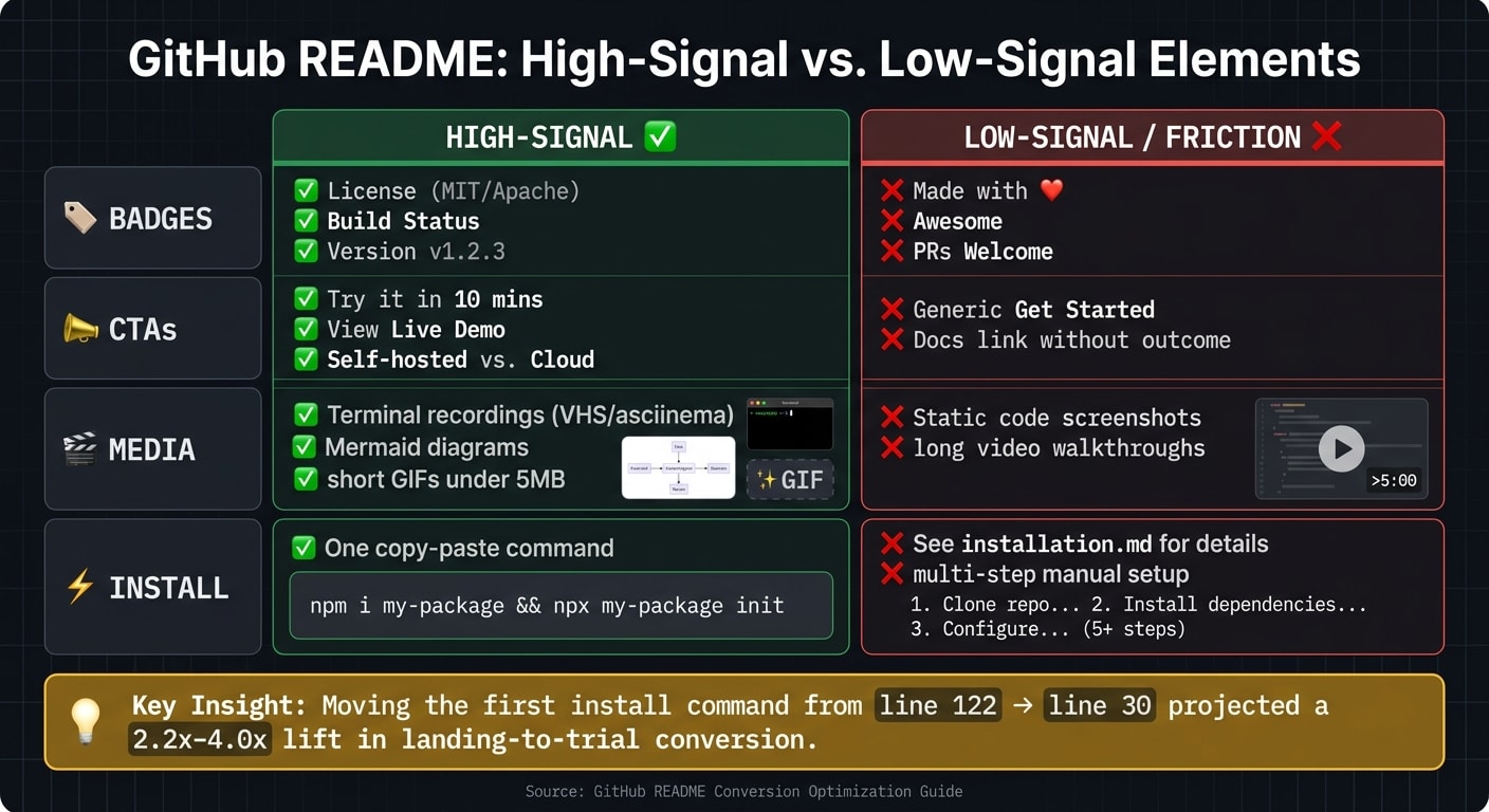
One example in the piece stands out: a project moved its first install command from line 122 to line 30 and projected a 2.2x–4.0x lift in landing-to-trial conversion. That tells me the problem is often not the product. It is the gap between interest and first use.
If I had to boil the article down to one idea, it would be this: make the first successful run easy, visible, and fast. Then measure what happens.
Measure the README Funnel Before You Rewrite It
After your README is live, look at where people drop off. Before you rewrite anything, figure out where the funnel cracks.
The funnel from repo visit to first successful run
The path through a repo is usually pretty predictable: someone lands on the page, skims the README, tries the quickstart example, and then decides whether to install . The biggest drop-off tends to happen between the first page visit and the first command they can actually run .
In June 2026, Anthony Chaudhary of the dos-kernel project ran a funnel audit and found that the first copy-pasteable install command was sitting all the way down at line 122. After moving it up to line 30 and cutting the jargon, the team projected a 2.2–4.0× lift in landing-to-trial conversion . The takeaway is pretty clear: shorten the gap between interest and the first successful run.
The metrics that actually matter
Stars don't tell you much about actual usage. Better signals include:
- star velocity
- GitHub Traffic unique visitors
- clone counts
- release downloads
- package installs
- UTM-tagged clicks to demos or signup pages
"Stars are a vanity metric. Dependent projects, weekly clones, and downstream issues filed are the real ones." - Daria Dovzhikova, Fractional PMM
How to estimate the README's influence on conversion
GitHub doesn't give you scroll depth or heatmaps, so you have to work with proxies. A simple way to estimate README-driven lift is to compare weekly GitHub Traffic unique visitors against package installs or release downloads .
If you want to see which parts of the README push people to act, add UTM parameters to every outbound link: ?utm_source=github&utm_medium=readme&utm_campaign=<repo-name> . Tag demo, docs, and signup links separately so you can see which one gets the best conversion.
Once you've mapped the drop-off points, you can start fixing the structure readers hit first.
Build a README Structure That Converts Skim Readers
Above the fold: value prop, install command, CTA, and badges
The first screenful should tell people what the project is, who it helps, and how to try it right away.
Use this order: project name, one-sentence positioning, hero visual, and install command. The tagline should follow this pattern: "[Project] is an open source [category] for [user] who want [outcome]." That line needs to be specific and tied to a result. A fuzzy label like "a modern toolkit" doesn't give someone enough to judge whether the project fits.
Keep only functional badges in this area - license, build status, version, and stars . Anything beyond that starts to push the install command down the page. A badge wall - 10+ badges before the first sentence - makes the project look more focused on optics than usability . If you add a hero CTA, keep it secondary to install.
Right after that first screen, move straight into the copy-paste path.
The first fenced code block should be the shortest working install path: one command, easy to copy, no placeholders, and no hidden setup. If that command fails on a clean machine, the README has already missed its main job .
Progressive disclosure that matches how developers scan
The rest of the README should answer the next question a developer is likely to have.
Use this order: Quickstart → Features → Docs → Community → Sponsors/commercial . Put Quickstart first. Keep it to 3 steps, and show the expected output. Once readers can get the project running, they're much more ready to look at features and dig into deeper docs.
Short paragraphs help here. Keep them to 1–2 sentences, and bold the key term in the first sentence of each section so skim readers can find their place fast . Use H2 and H3 labels that say exactly what's inside. For example, "Quickstart in 3 Steps" says far more than "Getting Started."
Hero media that helps without slowing the page
Media should earn its spot. Use it only when it clears up confusion faster than plain text.
A hero image or demo GIF above the fold can lift star-rate conversion in a way a text-only README often can't . For CLI tools, terminal recordings made with VHS or asciinema tend to work better than generic visuals. Keep animated GIFs under 5 MB so GitHub can render them inline . Use Mermaid.js for architecture diagrams because it renders natively on GitHub, which means you don't have to manage outside image assets .
Don't bury instructions in images. If a command appears only in a screenshot, no one can copy it, and the moment that image fails to load, the instruction is gone .
Write for Humans, AI Assistants, and Multiple Conversion Paths
Your README has to convert in two places: in the browser and inside AI-generated answers.
README formatting that improves AI citation and discoverability
76% of developers already use, or plan to use, AI tools in their workflow . That changes how people find projects. Developers now discover tools through AI answers and search. If your README isn't easy to extract, it's harder to cite and harder to surface.
AI assistants don't read a README the way a person does. They lean toward structured content they can pull cleanly, such as:
- explicit feature lists
- fenced code blocks
- standard headings like Install, Usage, Configuration, and Troubleshooting
- question-style headings when they match the query
A clever heading might stick in someone's mind. But a plain, direct heading is much easier for a model to match to what a developer asked. Each H2 should make sense on its own.
Your README is one of the main sources for search and AI extraction. Lead each section with the answer, then add context. Put install steps in plain text so assistants can parse them cleanly.
Calls to action beyond 'Star this repo'
Once the README is easy to scan and easy to extract, the next step is simple: give people a clear action to take.
A GitHub star is a signal. It is not the end goal. What you usually want is for someone to install the tool, join the community, or pay for it. So your CTAs should follow the way people move down the page: install → demo → join → sponsor → buy.
Keep one main CTA above the fold. That could be a live demo, a Try it in 10 minutes link, or a hosted playground. Put the rest farther down the README. After the Quickstart section, add secondary CTAs like GitHub Discussions, Discord, a sponsor button, and, if you sell a managed version, a Book a Demo or Contact Sales link. Add tags to outbound links only after you've picked the CTA and the section where it belongs.
Badges, CTAs, and media: a side-by-side comparison
Not every README element builds trust. Some of it is just noise. This table separates signals that help from signals that add friction, so it's easier to decide what stays.
| Element | High-Signal | Low-Signal / Friction |
|---|---|---|
| Badges | License (MIT/Apache), Build Status, Version | "Made with ❤️", "Awesome", "PRs Welcome" |
| CTAs | "Try it in 10 mins", "View Live Demo", "Self-hosted vs. Cloud" | Generic "Get Started", "Docs link without outcome" |
| Media | Terminal recordings (VHS/asciinema), Mermaid diagrams, short GIFs | Static code screenshots, long video walkthroughs |
| Install | One copy-paste command | "See installation.md for details", multi-step manual setup |
The pattern is pretty clear. High-signal elements cut down the work a reader has to do. Low-signal elements add visual weight without answering anything. A good gut check is simple: does this help someone decide faster, or does it just make the repo look busy?
Use these signals as your baseline before you test wording, placement, and traffic source.
Test, Iterate, and Drive Qualified Traffic to the README
A lightweight process for testing README changes
GitHub doesn't support native A/B testing, so the best move is simple: test one change at a time, let it run for two weeks, and then compare the numbers.
Before you touch the README, save a dated copy in a gist or private repo. That gives you a baseline. From there, choose one part with a big effect on conversion, like:
- the first-line category claim
- the hero image
- the quickstart code block
- the primary CTA placement
After two weeks, compare star velocity, clone counts, release downloads, and UTM-tagged signups. Add UTM parameters to every external link, such as ?utm_source=github&utm_medium=readme&utm_campaign=repo-name.
There’s one catch here: these tests are sequential, not simultaneous. So if you get a traffic spike, that two-week window can get noisy fast. If that happens, note it in your dated README copy and give the test more time before you decide anything. A one-day jump can look great and still tell you very little. Steady star velocity and clone growth are stronger signals.
Test first. Then roll out the version that lifts installs, signups, or downloads.
The anti-patterns that hurt conversion fastest
Once you have a baseline, fix the leaks that do the most damage first.
Most README conversion problems come from the same small set of mistakes.
More than 3–5 header badges can push the value prop below the fold.
Screenshots can't be copied or parsed. Fenced code blocks can.
A broken first install command can shut down conversion on the spot.
And if first-time visitors land in reference docs before they see a quickstart, activation usually slows down.
Conclusion: Fix the README, then send it qualified traffic
Fix conversion before you scale traffic. Measure where people drop off, tighten the above-the-fold section, use progressive disclosure, and format your Markdown so both people and AI assistants can pull information from it cleanly. Then test changes against real metrics before calling a result a win.
Distribution tends to work better when the landing surface already converts. Once the README is doing its job, traffic quality becomes the multiplier. daily.dev for Business can put your project in front of over 1 million developers, with targeting by seniority, language, and tools. That can be a good fit during launches, major version releases, or when you're publishing educational content that sends people back to the repo.
FAQs
How do I know if my README is hurting installs?
Your README may be costing you installs if it doesn’t cut uncertainty in the first ten seconds.
When someone lands on your repo, they’re making a snap call. They want to know three things right away:
- Does this solve my problem?
- Will this turn into a maintenance headache?
- How fast can I get something working?
If those answers are hard to find, people leave. Simple as that.
Here are a few warning signs to watch for:
- Visitors bounce before they try the code
- The value prop or quick start is buried
- Install numbers stay low even with repo traffic
- The quick start fails on a clean machine
What should go above the fold in a GitHub README?
Above the fold, lead with clarity and immediate value. Show what the project does, who it's for, and why it matters.
Include your project title, a one-sentence description, a few functional badges, a visual demo, and the shortest possible quick-start install command in a fenced code block that's easy to copy and paste.
How can I measure README conversion without A/B testing tools?
Use UTM parameters on every external README link so your analytics can tie signups, demos, and other actions back to the repo.
It also helps to track star velocity and clone counts as signals of interest. Those numbers won’t tell you everything, but they do show whether attention is growing or slowing down.
Then run the five-second test. If a new visitor lands on the page, can they tell the outcome, who it’s for, and what to do next in just a few seconds? If not, your README likely needs a clearer opening and a stronger call to action.