
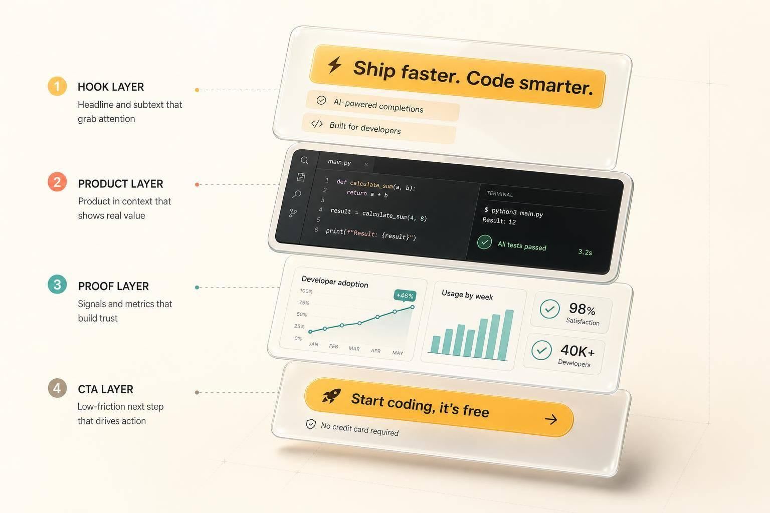
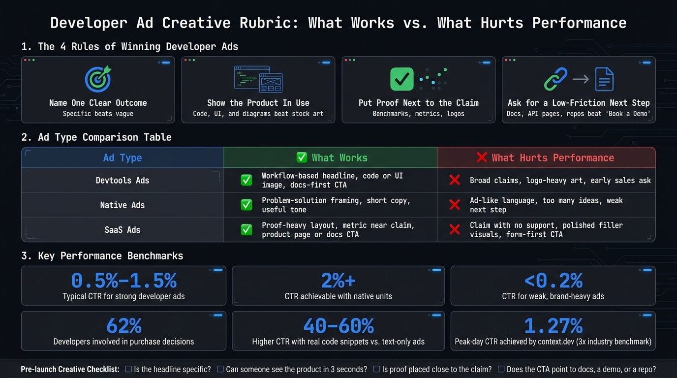
Most developer ads fail for one simple reason: they look like ads. From this teardown, I’d keep four rules front and center: name one clear outcome, show the product in use, put proof next to the claim, and ask for a low-friction next step.
I also wouldn’t judge ads by looks alone. The article points to a few numbers that matter: strong developer ads often land around 0.5%–1.5% CTR, some native units can pass 2%, and weak brand-heavy ads may stay under 0.2%. It also shows that developers often have buying influence, with 62% involved in purchase decisions.
If I had to boil the whole piece down, it’s this:
- Specific beats vague
- Code, UI, and diagrams beat stock-style brand art
- Proof near the headline beats unsupported claims
- Docs, API pages, and repos beat “Book a demo” on first touch
- One workflow + one proof point is a strong starting frame
- Testing many ad versions helps find what gets clicks
A few examples in the article make that pattern plain. Headlines tied to a known task, like React Native porting, PR review, web crawling, or query speed, work better because developers can size them up fast. Visuals that look like product screens or docs cut the time it takes to understand the offer. And proof like benchmarks, integration logos, GitHub signals, or outcome numbers makes the click feel less risky.
Here’s a quick comparison of the main ad types covered:
| Ad type | What tends to work | What hurts performance |
|---|---|---|
| Devtools ads | Workflow-based headline, code or UI image, docs-first CTA | Broad claims, logo-heavy art, early sales ask |
| Native ads | Problem-solution framing, short copy, useful tone | Ad-like language, too many ideas, weak next step |
| SaaS ads | Proof-heavy layout, metric near claim, product page or docs CTA | Claim with no support, polished filler visuals, form-first CTA |
So if I were reviewing a developer ad, I’d ask only four questions:
- Is the headline specific?
- Can I tell what the product does in about 3 seconds?
- Is there proof close to the main claim?
- Does the CTA fit how developers evaluate tools?
That’s the core of the article. Everything else supports those checks.
Using the daily.dev creative gallery as the source set
The daily.dev creative gallery is the source set for this teardown. It pulls together real in-feed and newsletter ads from brands running on the platform, including Amazon, Datadog, JetBrains, and Sentry.
What makes it handy here is its angle-based setup. You’re not just flipping through ads for ideas. You’re looking at them by pattern, which makes side-by-side analysis much easier. That also makes the next examples easier to compare with the rubric above.
This teardown zeroes in on the daily.dev placements that get the most developer attention: in-feed native cards, post page ads, and Digest sponsorships. The formats aren’t the same, so the ad treatment shouldn’t be the same either.
Here’s the key format detail:
- In-feed ads use a 1024 × 512 image and a headline of up to 80 characters, with 60 or fewer recommended.
- Digest sponsorships use a 680 × 512 image.
That matters because each placement rewards a different kind of framing. The same offer may need one angle in-feed, another on the post page, and another in the Digest.
Which creative categories are worth studying
For the next two teardowns, focus on devtools ads, native and inline ads, and SaaS product ads. These categories show repeatable patterns across campaigns and line up directly with the examples that come next.
How to read each example without overgeneralizing
The gallery shows what an ad looked like. It does not show how that ad performed.
So read each example as a pattern, not a scorecard. Use the rubric above as your lens. Pay attention to ideas that show up across multiple categories, not what one brand did in one ad.
With the source set in place, the first teardown moves to devtools ads.
Teardown 1: Devtools ads that win on recognition and proof
The best devtools ads lock onto one familiar workflow and one proof point. You can see that pattern across the gallery.
What the headline does: anchors on a workflow developers already know
In the strongest examples, the headline does two jobs at once: it names a workflow and makes a claim someone can check.
Amazon’s Fire TV campaign is a good example: "Port React Native Apps to Fire TV in hours, not weeks." It starts with something developers already know - React Native - then adds a payoff you can measure. CodeRabbit uses the same move with "Catch bugs before you even raise the PR" - a clear point in the dev cycle, stated in plain terms.
That’s why these headlines land. They don’t speak in broad brand language. They point to a job the reader already does, then show what gets better.
The strongest ads back that up with a thumbnail that shows the product, not just the company behind it.
Why the visual works: code and product UI beat generic branding
Developers scan code, terminals, and product UI far faster than polished brand art. If the thumbnail doesn’t show the workflow, many will assume the rest is just marketing copy.
| Thumbnail type | Clarity | Trust signal | Speed to understand |
|---|---|---|---|
| Code-first (snippet, terminal, config) | Shows how the tool fits the stack | High - proves the product is functional | Fast - syntax and output are immediately readable |
| UI-first (dashboard, error list, trace view) | Shows the actual experience | Medium-high - signals a mature product | Fast - visualizes the workflow at a glance |
| Logo-first (abstract art, stock imagery) | Often abstract or metaphorical | Low - reads as marketing filler | Slow - requires reading copy to find the value |
For in-feed placements, tight framing helps. A single error-grouping view, a YAML snippet, or terminal output showing a successful deploy can tell the whole story in one glance.
After the ad wins attention, the next step is simple: make the click feel safe.
What the CTA respects: docs, demo, or repo before any commitment
When developers check out a new tool, they usually want a hands-on test with low friction. That’s not the moment for a sales call. The CTA has to match that behavior.
Postmark’s native campaign on daily.dev shows what that looks like when the whole ad lines up with developer expectations. Trevor Rawls, Senior Marketing Manager at Postmark, said:
"The hardest part is usually reaching developers in a way that feels relevant instead of generic. They're quick to tune out broad marketing, so context and audience fit matter a lot."
The CTA pattern that works in devtools ads follows that same idea: "View docs" or "Try it in your browser." Those prompts work because they feel like a safe next step, not a commitment. The user is ready to evaluate, not get pulled into a long buying process.
When the product needs more explanation, the best-performing creative tends to lean more like content and bring in heavier proof.
Teardown 2: Native and SaaS ads that fit reading flow and still convert
If devtools ads work because they match a familiar workflow, native and SaaS ads work because they slip into the feed without interrupting how people read. They get attention by being useful first and promotional second. In the gallery, that usually means in-feed cards and post-page units.
Native ads: problem-solution headlines that read like useful content
The best native developer ads feel like content you’d want to click anyway.
A strong native headline calls out a problem, promises a clear result, and uses the kind of language developers already use - API, endpoints, tracing. Yahia Bakour, founder of context.dev, used the headline "Crawl Entire Websites In Seconds via API" in an in-feed campaign on daily.dev. That creative reached a peak-day CTR of 1.27%, about 3x the industry benchmark for text ads.
Body copy should stay tight: problem, solution, then a low-friction CTA. One problem. One proof point. One easy next step.
Once the product gets more complex, the ad has to show value inside the unit itself, not wait for the landing page to do all the work.
SaaS ads: proof-heavy layouts for more complex products
With a more complex product, the headline can’t do the whole job. Developers want proof close to the claim, not tucked away on a page they haven’t opened yet.
Postmark’s campaign on daily.dev used technical, non-generic copy such as "Critical emails require reliability, not guesswork" with proof close to the claim. It achieved a 1.54% account creation rate. The proof sat right beside the claim, so readers didn’t have to go digging for a reason to believe it.
| Proof Type | Trust Impact | Space Efficiency | Best Use Case |
|---|---|---|---|
| Outcome Metrics | High | High | Performance and reliability tools |
| Logo Bars | Medium–High | High | Established products |
| Testimonial Fragments | High | Moderate | Complex products needing credibility |
| Integration Badges | Medium | High | Ecosystem and workflow fit |
A strong SaaS ad often combines one metric, a small logo bar, and a few integration icons in a single view. That setup helps a developer judge credibility in seconds, without scrolling. The CTA should send them to docs, an example, or a product page, not a sales form.
Visuals that look like docs, not ads
Developers scan docs every day. They’re used to dashboards, terminal output, and architecture diagrams. That’s why those formats tend to work better in ad visuals than polished brand art.
A screenshot of an error-grouping view, a YAML config snippet, or a latency graph with a problem endpoint highlighted can show what the product does almost right away. Abstract gradients and stock photos usually can’t. They make the reader do extra work just to figure out the product, and in a native feed, that extra friction often leads to a scroll-past.
In native placements, fast comprehension beats novelty. A simple diagram showing where a logging collector sits between microservices and the rest of the stack tells the story faster than a glossy hero image. The visual needs to answer one question at a glance: what does this tool do in my workflow? If it can’t do that in under three seconds, it’s hurting the ad instead of helping it.
These are the patterns worth reusing in creative review.
What to reuse in your next daily.dev Ads campaign
The pattern that appears across winning developer ads
Across the devtools and native/SaaS examples above, the pattern is pretty simple: one clear outcome, a product-in-context visual, proof placed right next to the claim, and a low-friction CTA.
The best-performing ads keep repeating that formula. Tinybird led with "150x faster queries, 75% lower costs. Solo dev migrated MongoDB to ClickHouse®" . DragonflyDB used "A Redis Alternative with 25X higher throughput" . context.dev hit a peak-day CTR of 1.27% , and Postmark reached a 1.54% account creation rate . That didn’t happen because of fancy tricks. It came from numeric claims with proof sitting close to the headline.
Swap vague adjectives for numbers. Ads with real code snippets can get 40–60% higher CTR than text-only ads . That’s why a 3–5 line syntax-highlighted snippet is often a smart move. It shows the product fast and gives developers something concrete to react to. On top of that, run 10–15 variants by changing the hook, the visual, or the offer so the platform has room to learn what people respond to .
The same idea still works when the product is more complex. The only difference is that the proof needs to sit even closer to the claim.
A short review rubric for creative approvals
Before launch, check four things:
- Is the headline specific?
- Can someone see the product within 3 seconds?
- Is proof placed close to the claim?
- Does the CTA point to docs, a demo, or a repo?
If any answer is "not really", fix that part before launch. The daily.dev Ads copy-practices post and the dev-proof creative checklist go deeper into the mechanics.
Key takeaways and video pairing note
Specificity beats polish. Generic claims lose to concrete ones. Brand visuals lose to product screenshots. Soft CTAs lose to clear, low-commitment next steps. A headline like "A Redis Alternative with 25X higher throughput" gets the click in a way vague positioning just doesn’t.
These are the same patterns highlighted in the video walkthrough. This post maps to the video segment "Which developer ad creatives actually work? Creative review", which will be embedded here when public.
FAQs
How many ad variants should I test first?
Start with 10 to 15 ad variants. And make sure that includes at least 11 headline options, so the platform has enough room to find what works across placements and contexts.
Then keep your testing clean: change one thing at a time. That could be the headline, the image, or the call to action. If you swap multiple elements at once, it gets hard to tell what actually moved the needle.
That way, you can spot winning versions more clearly while the budget flows toward the top performers.
What should I do if my product is hard to show visually?
If your product is tough to show in a visual way, make the ad easy to read and easy to check instead.
Start with clear outcomes that matter to developers. Then back them up with specific technical details, like benchmarks, tested code, or a diagram that explains one idea well.
Keep the headline short. Use an action-focused CTA such as "Try API Sandbox" so the next step feels concrete, not vague.
Your visuals should stay responsive, accurate, and low-pressure. That helps the ad feel useful instead of pushy or misleading.
When should I send developers to docs instead of a product page?
Send developers to docs when the value hinges on verification and details, like limits, edge cases, or system dependencies. The same goes for products that take more than a minute to grasp.
If the ad feels believable but can’t explain the offer in a short headline and body, use a View Docs or View the documentation CTA. That gives developers a fast way to check fit, confirm the claims, and move from proof to setup.